Tag Archives: Leaf

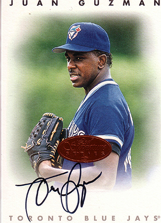
I Was a Teenage Prospector: Juan Guzman

Guzman Auto

Juan Guzman was one of the first baseball players that I ever saw up-close-and-personal-like. I guess it was summer of 1994, and a friend had somehow scored AMAZING tickets, right down the first base line, behind the first base dugout at Camden Yards, and like three rows up. I’ve never been so close to a game, and it spoiled me for years afterward. Anyway, I kind of remember Guzman coming over and signing autographs, but I DEFINITELY remember watching him warm up so close to us. I was amazed at how close the mound was to home plate. It seems a whole lot closer when you’ve got some flamethrower out there, let me tell you.

It took a lot of digging, and I thought it had gone down before the year of my high school graduation, but apparently not – July 31st, 1994, was the first time Guzman pitched at Camden. He didn’t exactly pitch a gem, but he got the win against a decent Baltimore lineup. Looking at that lineup, I feel pretty honored to have seen some of those guys: Devon White, Robbie Alomar, Paul Molitor, and John Olerud (my second time seeing my hero in action). Not to mention, of COURSE, Cal Ripken, Harold Baines, and Rafael Palmeiro, who I liked a lot at the time.

I also remember this game as a big deal for the neighborhood rivalry – Ben McDonald versus John Olerud – the ultimate answer to who was better. The victor? Well…Olerud went 2 for 3 with a homerun and a triple. McDonald? 6 ER in 5 innings. Olerud supremacy!

Leave a comment

Filed under I Was a Teenage Prospector, Toronto Blue Jays

1986 Donruss/Leaf #1

I think I’m due for a team post here or there, especially after looking at my collection again last night. I pulled the complete 86 Leaf set from a box of 1986 Leaf I purchased at a flea market back in 2004, but I only got the complete 86 Donruss team set this year. In the interests of space and boredom, I will only choose one of the sets for each player, as they’re basically the same thing with a different logo.

Hubie Brooks had the best year of his career in 1986, hitting .340/.388/.569, good for a 161 OPS+ and 4.7 WAR. Consider that he was playing shortstop, and he looked like the real deal.

Tim Burke was in his sophomore season, and had a 9-7 record with a 2.93 ERA but a 1.470 WHIP. Still, he was worth 2.1 wins above replacement, and would improve.

Andre Dawson was, of course, in his last year as an Expo. 1986 was another solid year for the Hawk, as he hit .284/.338/.478 with 20 homers and 18 SB. His speed was nowhere near where it had been earlier in his career, but he was still a well-rounded player, especially for that era.

Mike Fitzgerald only played in 73 games in 1986, hitting .282/.364/.440, pretty damn respectable for a backup catcher, good for a 0.7 WAR. As annoying as getting Fitzgerald cards can be, he wasn’t a terrible player that year.

Leave a comment

Filed under 1986 Donruss/Leaf

Morning Coffee and the Blog Roundup – 9/30

That’s the card that I got from a group break on Thorzul’s site recently…wasn’t sure where to post about it, so this made the most sense.

Blog-related first, I’m not sure if I’m going to be posting any entries tomorrow. I’m getting my car repaired and on top of that have a lot of work to do tonight to prepare for a trip out of town. It’s going to be iffy, but I’ll try to make it work. Life just conspires against you sometimes.

Have a few group breaks on my radar this month…got in on I Am Joe Collector’s Topps Chrome break (btw, congrats on the great interview), and I’m hoping to get in on Nachos Grande’s break, as that just looks like a lot of fun.

The cards of the 1989 Project are all compiled and set to go once I finish the 88 project. I’m rethinking the format, though, as the team posts have gotten…ponderous. I may stick only to the stars/relevant rookies/interesting players. By the time I get to 1990, I may have this thing figured out, which also reminds me, I decided that the 1990 Leaf set counts as an “update” set for the purposes of the project. This is going to get a lot murkier as time goes on with cards being issued in series. I’m still thinking about how to handle the situation, and once we get past 1994 the whole point of the thing becomes moot.

Looks like the Nationals are going after a front-line starter in the offseason. I support this, and going after Zach Grienke is what I’d like to see. I think we could offer the Royals a really attractive package, and Zach would get a chance to play for a contender (at least in the next few years, I think). But Matt Garza may also be available, so…there’s a lot to think about. It’s an exciting prospect.

Okay, let’s look at what happened yesterday in the intertubes…

All you people on the east coast, stay dry and safe.

Leave a comment

Filed under Blog Roundup

John Olerud 1992 Cards #2

1992 Leaf

1992 Leaf Black

Okay, on we go. Do you know how badly I wished that Black Gold design would be the real Leaf design? I think the history of Leaf might have gone very differently if they had gone with that design as the base. Or a world where they jump from the 1990 design straight to the black border design. I know lots of people either don’t like gold leaf or are sick to death of it, but I like it when it’s used correctly, and I feel this is the correct application. Now, as for the card itself, I would’ve preferred a better shot than his back, but I guess it’s interesting, especially in the context of the numerous fielding cards we’ve seen so far.

1992 Pinnacle

I’m so torn on this set. I really like the design, the black borders, the coloring…but there’s something that always made the set feel “cheap” to me, and I can’t put my finger on it. I suspect it’s because it’s a throwback to a little different school of design, where the design is the centerpiece and the photograph plays second fiddle. I just can’t help but wonder what that picture would look like if it was allowed to fill that entire black space to the upper right-hand corner. Although it is another average picture. Ho-hum.

1992 Pinnacle Team 2000

Now THAT is what I’m talking about. Why couldn’t they have made the Pinnacle design look like that? I love it; the design elements are neatly placed on the left-hand side, with a full-bleed to the top and right of the card. The photograph becomes of far more importance, and you get the nice black borders with gold leaf. It’s a win-win decision. I like this card so much I’ve purposefully bought multiple copies with an eye toward filling a page with them. I may try to put the set together one day; watch this space.

1992 Score

You know, I had never made the connection between the 92 Score and Pinnacle designs, but they have a lot in common. You have the design elements taking up 3/4″ of the card, to the point where they become the main focus rather than the photo. The lines are similar, from the lines at the bottom to the top. Hell, the photo on this card is even similar. Obviously, the colors are different, but it does make me wonder if the same guy who designed this designed Pinnacle that year.

1992 Score Impact Player

And here we have an example of what I like about the Team 2000 card all over again. Design elements are relegated to the lower left corner (though lifted a bit off of the picture, allowing for the photo to bleed to that edge), leaving the rest of the card for the photo. And it’s actually a well-constructed photo. This card is a darkhorse favorite of the early 90s for me, and I’d never put together why until I saw it side-by-side with the Team 2000 card. Again, same designer? We may never know.

2 Comments

Filed under John Olerud

About the Pseudo-Leaf Revival

Ugh, I hate it. While I’m aware the Leaf name didn’t really mean a whole lot outside of Canada and the early 90s, I do have a strong identification with that era and especially the 1990 issue.

1990 Leaf

Sure, the name hasn’t meant much for years, but it is part of a tradition in sports cards. A tradition that doesn’t include crap like this:

I have to be honest here: I hate Razor and what it stands for in the hobby. It’s the ultimate outcome of the hit mentality. I strongly dislike the way they cut autographs out of photographs, the fact that they produce cards without any photography and inherently lazy design, and the thought of them taking over a brand like Leaf makes me grit my teeth.

It’s just disappointing.

Leave a comment

Filed under Administrative, Current Events

Contents of the Mysterious Box of Mystery, Act I

So the other day I posted a shot of the box that my friend Robbi sent to me. I’ve finally had some time to sit down and sift through the box, sorting out the Expos and Olerud cards that I want, along with some trade bait and the…other…stuff that I want to show here. This box originally belonged to a dear friend of mine who was like a brother to me. He passed away at a tragically young age in 2007, and his widow has had this box kicking around ever since then. She thought it would be more fitting for me to have it, so she sent it my way. And I know just what to do with it.

1992 Leaf Marquis Grissom

As I expected, the box was full of junk wax – beautiful, glorious junk wax. Monetarily, sure, it’s worthless, but the funny thing is my collection is oddly devoid of junk wax. The bulk of my collection is from the mid-00s, and I always had trouble with paying money for junk wax cards, so I kind of rely on trades and “donations” to fill in these gaps in my collection, which means there were a lot of cards I didn’t have, like the Grissom above and the Colbrunn, below. There were also a few John Olerud cards, but nothing that I didn’t have already.

1991 Bowman Greg Colbrunn

I was born in 1976, so I decided to start collecting the 76 set a few years back. I’m still WAY short of the set, but the box contained two 76 cards I didn’t have, including this beauty. Just feast your eyes upon the maximum 70s contained herein. The pornstache. The glasses that swallow his entire face. I just…I just shed a tear.

1976 Topps Bob Coluccio

I’ll cover a lot more of the junk wax-era stuff later, but for now I want to take a look at some of the other stuff in the box. You see, Jeremy was a football collector and a non-sports collector, and some of this stuff is just incredible. I’d never seen it before. Like this Peanuts All-Star Sally card (one of two Peanuts All-Star cards in the box):

I believe these were from Hostess.

There were also TONS of 1990 NFL Pro Set cards. Man, I had a ton of these back in the day, but the whole trend of non-numbered, supposedly rare cards in the Pro Set…sets…started with the Santa Claus phenomenon and reached its logical conclusion in a super hero specifically created by the NFL and Marvel…SUPERPRO! Boy did this card bring back memories.

YES

He also had some wrestling cards from the mid-90s that I didn’t even realize existed, but man, was it a trip. Presented last, but certainly not least, in this edition, I give you Paul Bearer. What a face.

Leave a comment

Filed under Mail Call

Game-Used: Michael Barrett

I have a decent collection of Game-Used and Autograph cards from the Expos and Nationals, so I figured I’d dedicate a regular feature to them. First up is Michael Barrett from 2002 Leaf Certified Materials.

2002 Leaf Certified Materials Mirror Blue

I’m definitely not a Michael Barrett fan, but I love this card. First of all, I’ve already said I’m a sucker for the whole Leaf Certified Mirror Blue/Red/White gimmick, for some reason (okay I know the reason – ooooh shiny!), and when you throw in a cool little jersey piece with the stitches showing? Yeah, I’m there. The only thing that annoys me is the logo – who the hell is supposed to be able to read that? I sure can’t.

Leave a comment

Filed under Game-Used

John Olerud 1991 Cards #2

One end-of-the week post to go, and I figured I’d tackle some more 91 Olerud cards. Just as a note, this is definitely not meant to be a definitive overview, but rather what I have in my albums so far…

1991 Fleer

Dear lord, I abhor the 1991 Fleer set. There’s just nothing appealing to it for me. The yellow borders are god-awful, the line design looks more fitting for a textbook, the photography ranges from blah to downright awful, and the card stock renders the photos themselves even muddier. I hope whoever came up with this was not in the baseball card business long. That said, this isn’t a completely terrible card; the shot is kind of nice (if blurry).

1991 Fleer Ultra

That’s more like it. While it may not have the flash or grace of later Fleer Ultra issues, I have a soft spot for the first issue. It’s like an awkward baby who shows promise, and I think this card itself is just pretty, even if you can’t see John’s face. The blues just balance so nicely, and I even like the placement of the Ultra logo. Definitely one of the better 1991 issues.

1991 Leaf

Or, how to take a good concept and smother it in its sleep. I LOVE 1990 Fleer to this day, and even have this pie-in-the-sky idea of collecting the entire set one day, as expensive as that might be. But 1991 Fleer? Ugh. I guess I get what they were going for, but this seems like a far more drab, oppressive border, and it takes a significant portion of real estate that was dedicated to the photo  in the 1990 issue.  Throw all those issues on top of a boring photo, and I just don’t care for this card at all.

1991 O-Pee-Chee Premier

This is not my beautiful O-Pee-Chee. I still plan to acquire his regular-issue OPC from that year, but ugh. What a busy, ugly border. The photo is even darker than this scan shows, and I don’t like the back of the card, either. I’ve come to the conclusion that 1991 was just not a good year for baseball cards at all. Thankfully, there are still a few decent issues to come.

Leave a comment

Filed under John Olerud

Failed Prospect: Danny Rueckel

2005 Leaf Certified Materials Mirror White

For the longest time, I thought I missed out on Danny Rueckel’s time in Washington before I realized that he just never made it, which, oddly enough, was when I covered him as one of the first players I on this blog. At the time, I wasn’t sure how many Rueckel cards were out there, but I stumbled across this one late last summer and never got around to covering it before I took my hiatus. I’m pretty sure he’s out of baseball now, as the last mention I can find of him anywhere is 2007, the same time his stats stop. It’s a bit surprising because he wasn’t a *bad* pitcher, just didn’t have the gaudy numbers of others. I wonder if he got injured?

Either way, even though this card isn’t worth a lot, I still like it. I’m a sucker for the Mirror White parallels and it’s neat to see an instance of those godawful Spring Training uniforms from that first spring. I’ll have to see if I can find some more Nats from this set.

Leave a comment

Filed under Failed Prospects, Nats Failed Prospects

More John Olerud Rookies

We’ll continue our trip through Olerud’s “Cardography” for lack of a better term with some more 1990 issues, some more obscure than others.  Yesterday we covered Classic, Donruss, and Score, so let’s pick up again with those. First up is Olerud’s Donruss the Rookies issue.

1990 Donruss The Rookies

This has to be one of my favorite of his rookie issues. I love the blue and green, and of course it’s an action shot. I remember being a little disappointed that this would not be his actual rookie issue, while the bland assy red version would be. It sucked. But hey, at least this one got issued, and it’s a nice one. I have three copies.

1990 Donruss Baseball's Best AL

He also had an issue in the confusing-as-hell overkill Baseball’s Best set from that year, but it was nowhere near as nice. Contrasting blues and a generic shot. Yawwwwwwn. I remember finding this in a dollar bin in like 1993 and being all “what the hell??” I’ve since gotten another copy, but I only accept them as doubles, rather than seeking them out.

1990 Classic III

I *want* to like this card. It was nice to get a good action shot, but the design is still just too hideous, although a bit tempered without that neon pink. I picked up the Classic III set day-of, however, as it featured the first cards of players like Chipper Jones and I wanted in on that. To this day, however, I’m more than a little cranky toward Classic. It was one of the worst offenders in trying to get rookies ASAP, and that crap got old.

1990 Bowman

Just..eww. 1990 Bowman is fugly, and it doesn’t help that almost every shot is a spring training shot AND they somehow managed to make a wire-thin 6’5″ guy look huge. Where does that double chin come from? One of my least favorite Olerud issues of all time, and that’s saying something.

1990 Fleer Update

Workmanlike. That’s how I’d describe this. It’s just kind of there. Still, as a kid, the 1990 Fleer Update set excited the hell out of me with exotic players like Oscar Azocar (RIP) and Jim Leyritz, and getting a new Olerud rookie was a gigantic bonus. I’ve only gotten two of these over the years, but I’m guessing that’s more because I just feel ambivalent toward it.

1990 Leaf

Now THIS was the rookie to have in 1990. And hell, it’s still pretty awesome. Good shot, good composition, and I love the design. One of these days I want to buy a high-graded version of this card to have some sort of “definitive” version of his rookie card. I see them on ebay every now and then. Oh, and you’d better believe I was psyched to pull this out of a pack back in the day.

1990 Blue Jays Fire Safety

Last, but not least (for this batch), one that I only found recently. This was a team-issued set. I’m glad I never knew about the existence of these when I was young, because it would have driven me insane. They’re hard enough to find in the Internet era, pre-Internet I would have just torn my hair out. oh, don’t mind the crud on it, I scanned these in pages, and that’s on the page. As for the card itself…eh…it’s just all right. The design is what you’d expect for a set like this, and the photo is just all right, though it was neat to see something from his rookie season I’d never seen before.

Okay, next entry should get us out of 90 and into 91!
Leave a comment

Filed under John Olerud